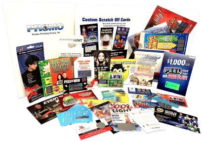
Custom scratchers are among the promotional items that leave the strongest mark on people. These cards attract attention and make people remember the brand after they discover something exciting behind the designs. Still, flaws in design can make your campaign a total waste of resources. Following these tips will make sure your scratch-off cards have their most impact after printing.
Common Design Pitfalls to Avoid
- Overly Complex Layouts: Cramming too much text or graphics into a small space makes scratchers look cluttered and hard to read, reducing user engagement.
- Insufficient Contrast: Failing to use contrasting colors for the scratch-off area and underlying design can make it difficult for users to see where to scratch or what they’ve won.
- Tiny Text for Prizes or Instructions: If winners have to squint to read their reward or how to claim it, you risk frustrating recipients and undermining the promotional goal.
- Ignoring Regulatory Requirements: Some jurisdictions require specific disclaimers or odds disclosures on promotional scratch cards. Overlooking these can lead to legal headaches.
- Low-Quality Scratch-Off Material: Using cheap or overly thick scratch-off coatings can cause tearing or prevent the coating from fully removing, leaving participants unable to reveal the prize.
Why Thoughtful Design Matters?
The ideal custom scratcher has both style, function, and meets all the rules and regulations. Apart from the common mistakes, you should also plan the user’s experience: from noticing your logo to getting excited about a prize and knowing how to get it. Packaging design makes using a product enjoyable and also makes the brand look more trustworthy to people. Before approving artwork, look at a print prototype to see how you can scratch, read it, and if it works well in real situations.

Best Practices for Designing Effective Scratchers?
- Make the font of the rewards, tasks, and brand name bright enough to stand out against all photos.
- Make sure the values of prizes, the main call-to-action instructions, and all disclaimer text are easily noticeable.
- Including brand elements such as a logo, phrase, and color scheme helps people identify your company while still letting them concentrate on the prize.
- Pick foil or latex that has been proven to be easily removed and without leaving much residue behind.
- Simplify how they get their gift by placing a short URL or QR code next to step-by-step guidelines for winning gifts on a mobile.
Conclusion
Make sure to dodge these usual errors and you’ll have your brand message well displayed to and loved by your recipients. Sticking to clarity, compliance, and quality things you use ensures that users have a smooth experience and bring you better results. For top advice on artwork, the right products to use, and printing, turn to Promo Printing Group.
